Specialty Business Card Artwork Guide: How Different Materials Affect Your Design
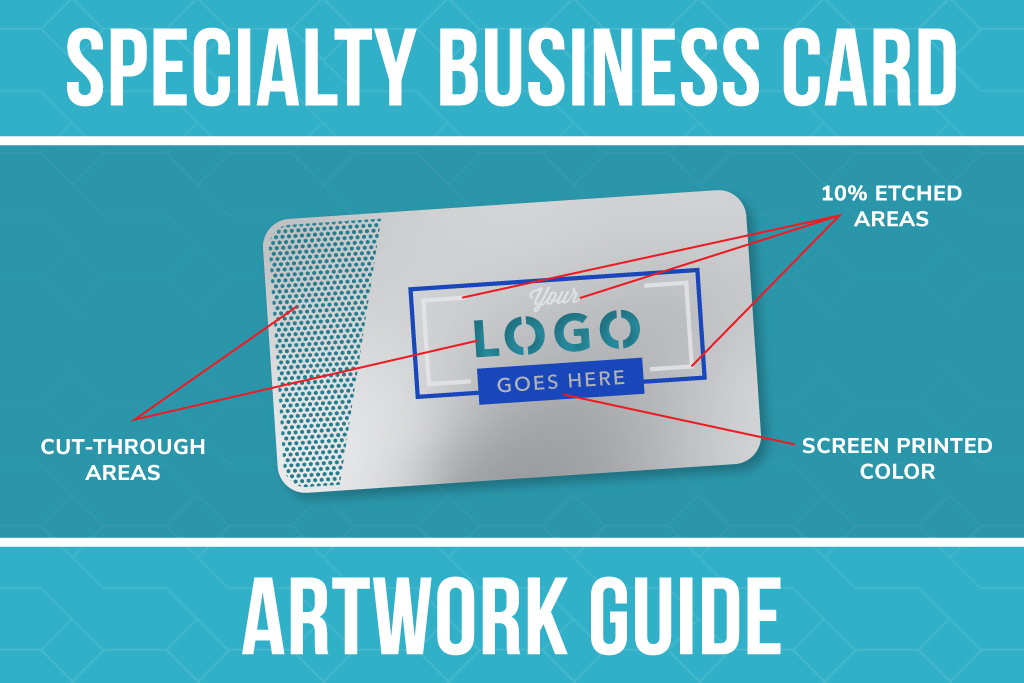
Designing a business card is one thing. Designing a business card that looks great on metal, plastic, or wood? That’s where things get a little more interesting.
Unlike traditional paper cards, specialty business cards introduce different materials, finishes, textures, and production methods that can dramatically change how artwork looks on the finished product.
A design that looks fantastic on black metal might need some adjustments to work on stainless steel. Bright colors that pop on white plastic may look completely different when printed directly onto natural wood.
For resellers and designers, understanding these differences is essential to delivering a finished product that meets your customers’ expectations.
This specialty business card artwork guide breaks down how to approach designs for metal, plastic, and wood business cards, including the production methods, material considerations, and design opportunities unique to each.
Metal Business Cards: Designing Around the Finish
Metal business cards offer some of the most versatile customization options in the specialty card market.
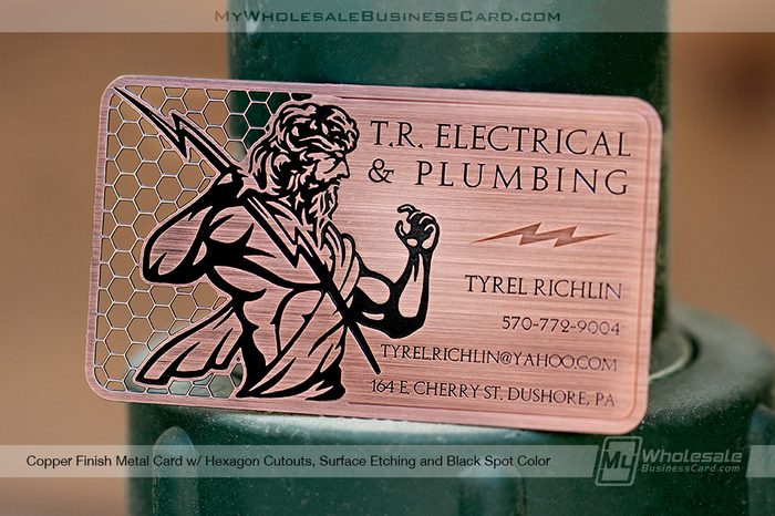
Depending on the material and finish, designs can incorporate chemical etching, laser etching, screen printing, custom cutouts, and even completely custom card shapes.
But before deciding how to decorate the card, there’s one important consideration: the metal itself is part of the design.
Stainless Steel: Let the Metal Do Some of the Work
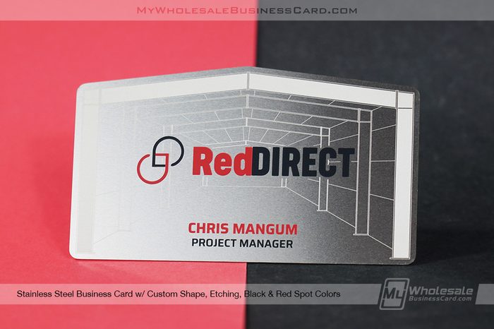
Stainless steel business cards have a naturally reflective, silver-toned surface that can become a major design element.
Rather than covering the entire card with artwork, designers can use the exposed metal to create contrast between printed, etched, and untouched areas.
For example, a logo can be etched directly into the stainless steel while the surrounding surface remains smooth and reflective. Alternatively, screen-printed colors can be introduced to create contrast against the silver background.
Design tips for stainless steel cards:
- Use the natural silver finish as part of the artwork.
- Consider etched logos, patterns, or text for a subtle, professional appearance.
- Incorporate screen printing when the design calls for additional color.
- Use negative space to create contrast without overcrowding the card.
- Consider how reflective surfaces may affect the appearance of fine details.
Stainless steel is particularly well-suited for designs that take advantage of the material’s natural appearance rather than trying to hide it.
Black Metal: Create Contrast That Counts
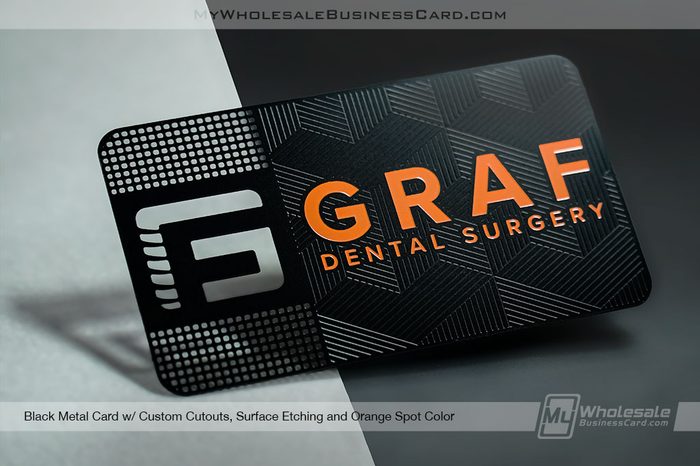
Black metal business cards require a different approach.
Because the base material is dark, artwork needs enough contrast to remain visible and legible.
Laser etching can reveal the lighter metal beneath the black surface, creating silver-toned artwork that stands out against the dark background.
Vibrant screen printed colors offer great contrast against the deep black of the metal.
Design tips for black metal cards:
- Use laser-etched artwork for strong contrast against the black finish.
- Avoid overly fine surface etched details that may become difficult to distinguish.
- Consider how light and dark areas work together.
- Keep small text readable by choosing appropriate font sizes and weights.
- Use the black background intentionally rather than treating it like a white canvas.
A simple logo and a few carefully positioned details can often be more effective than an overly complicated design.
Brass, Copper, and Other Metal Finishes: Work with the Color
Not all metal cards have a neutral silver or black appearance.
Brass, copper, and other specialty metal finishes introduce their own colors, which can influence how artwork appears.
For example, a design created for stainless steel may rely on silver negative space. Transfer that same artwork to brass, and those exposed areas now have a warm, golden appearance.
Similarly, colors that contrast well against stainless steel may not have the same effect against copper.
Design tips for colored metal finishes:
- Consider the natural color of the metal when selecting artwork colors.
- Use etched and exposed areas to highlight the material’s appearance.
- Avoid assuming that printed colors will look identical across different metal finishes.
- Evaluate contrast carefully, particularly with small text.
- Adjust artwork when switching between cool-toned and warm-toned metals.
Reseller Tip: When offering customers multiple metal finishes, don’t assume one artwork file will work equally well for every option. Small adjustments to color, contrast, and placement can make a significant difference.
Metal Card Cutouts and Custom Shapes: Designing Beyond the Surface
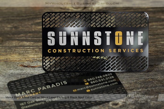
One of the biggest advantages of metal business cards is the ability to customize more than just printed or etched artwork.
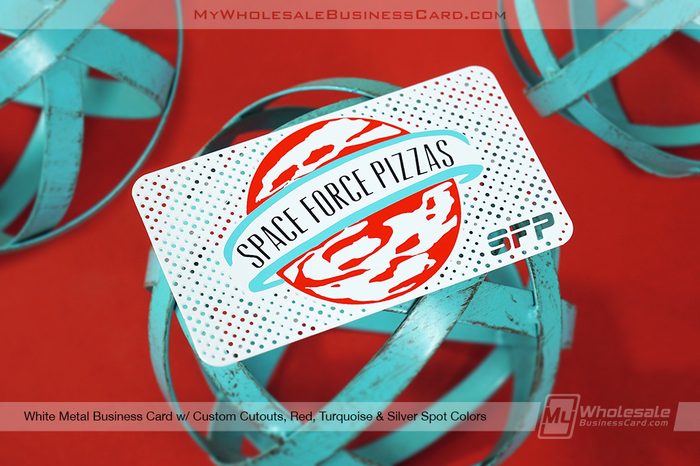
Custom cutouts allow portions of the metal to be removed, creating openings within the card itself. These can be incorporated into logos, patterns, or other design elements.
Custom shapes take things further by changing the outside profile of the card.
However, designing for these features requires additional planning.
Designing Artwork With Custom Cutouts
When incorporating cutouts, designers need to consider the structural integrity of the finished card.
Extremely thin connections, tiny openings, and intricate patterns may not translate well into a physical metal product.
It’s also important to consider how cutouts interact with surrounding text and artwork.
Best practices include:
- Avoiding extremely thin metal connections between cutout areas.
- Keep important text and design elements away from cutout edges.
- Simplifying intricate shapes when necessary.
- Using cutouts strategically rather than adding them simply because they’re available.
- Confirming production feasibility before promising a complex design.
Designing Custom-Shaped Metal Cards
Custom-shaped cards can be a great option for customers who want something beyond a traditional rectangular business card.
But an unusual shape shouldn’t come at the expense of functionality.
Consider how the card will be carried, stored, and handed out. Sharp projections, fragile extensions, and extremely narrow sections can create practical problems.
A well-designed custom shape should complement the customer’s branding while remaining comfortable to handle.
Reseller Tip: Encourage customers to think about the card’s physical shape early in the design process. Trying to fit completed artwork into a custom outline afterward can create unnecessary revisions.
Plastic Business Cards: Understanding Finishes, Color, and Transparency
Plastic business cards offer a different set of design opportunities.
While metal cards often emphasize etching and the material itself, plastic cards are particularly well-suited for full-color artwork, photography, gradients, and detailed branding.
However, the finish and transparency of plastic can significantly affect the final appearance.
Glossy Plastic: Bright Colors and High Contrast
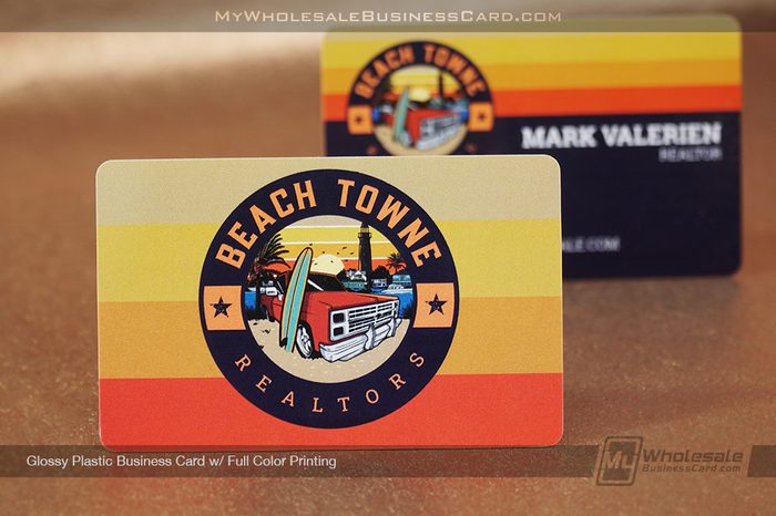
Glossy plastic business cards have a smooth, reflective finish that can enhance the appearance of colorful artwork.
They’re a popular option for designs featuring photographs, bold graphics, and vibrant branding.
The glossy surface can make colors appear more vivid, although reflections may be more noticeable under certain lighting conditions.
Design tips for glossy plastic:
- Take advantage of vibrant colors and detailed artwork.
- Consider glossy finishes for photography and gradients.
- Keep important text readable against busy backgrounds.
- Be mindful of glare when choosing text colors and placement.
Glossy plastic can work particularly well for business cards, gift cards, loyalty cards, and membership cards that feature colorful branding.
Matte Plastic: A Softer, More Subtle Appearance
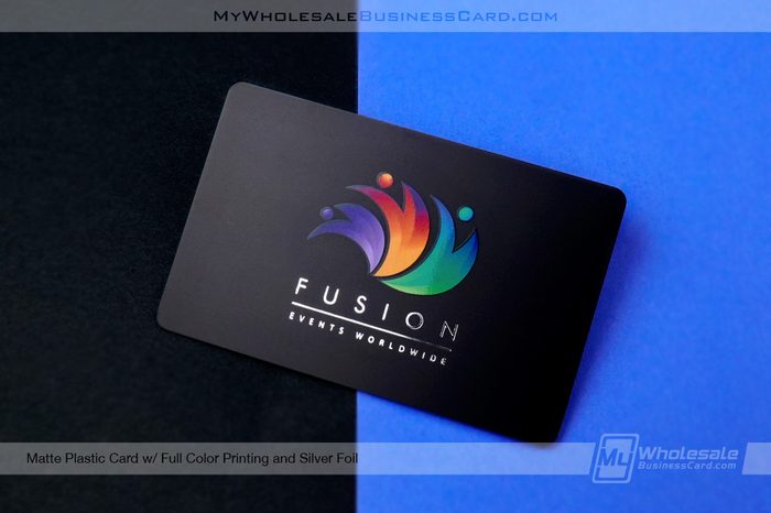
Matte plastic cards offer a less reflective surface, creating a more understated appearance.
Colors may appear softer compared to glossy plastic, making matte a good choice for minimalist layouts, muted color palettes, and designs with a more refined aesthetic.
Matte cards can also incorporate specialty enhancements, including gold or silver foil, and spot UV, where available.
Spot UV allows selected areas of the artwork to receive a glossy treatment while the surrounding surface remains matte.
This creates contrast between the two finishes without requiring additional colors.
Design tips for matte plastic:
- Consider minimalist designs and subtle color combinations.
- Use spot UV to emphasize logos, patterns, or selected details.
- Keep glossy accent areas intentional rather than applying them everywhere.
- Consider how the matte finish will affect the overall appearance of the artwork.
Both matte and glossy plastic cards can also incorporate gold or silver foil, offering additional ways to highlight important design elements.
Clear Plastic: Design With Transparency in Mind
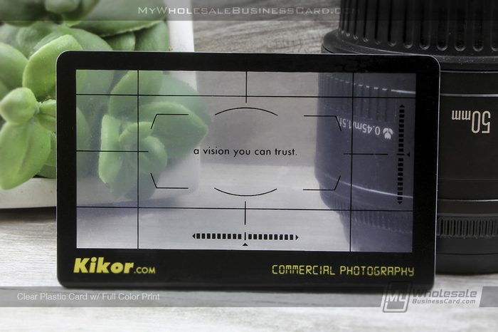
Clear plastic cards require a different way of thinking about artwork.
Unlike traditional opaque cards, the transparent material allows the background behind the card to remain visible.
That means areas without printed artwork become part of the overall design.
While this can create an interesting visual effect, it also introduces some important considerations.
For example, dark text printed on a clear card may be easy to read against a light background but much harder to see against a dark surface.
Design tips for clear plastic:
- Use transparent areas intentionally.
- Avoid placing critical information where background interference may affect readability.
- Consider adding a white ink backing layer behind selected artwork when supported by the product.
- Remember that colors printed without an opaque backing may appear translucent.
- Keep the layout clean enough for the transparency to remain a feature.
Clear plastic is especially effective when the artwork is designed specifically for the material rather than simply transferred from an opaque card.
Translucent Plastic: Finding the Balance
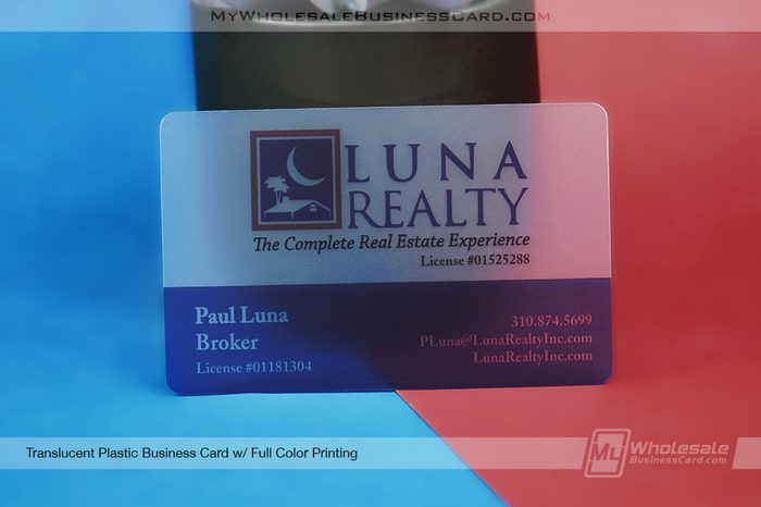
Translucent plastic cards fall somewhere between clear and opaque.
They allow light to pass through while providing a frosted or partially transparent appearance.
This softer transparency can create a distinctive look, but it also affects how printed colors and fine details appear.
Design tips for translucent plastic:
- Choose colors that remain visible against the translucent background.
- Avoid relying on extremely subtle color differences.
- Consider how the card will look against different surfaces.
- Use white backing layers where available and appropriate.
- Keep text contrast and readability a priority.
What About Custom-Shaped Plastic Cards?
Unlike metal business cards, plastic cards do not typically come standard with custom cutouts.
Simple custom shapes may sometimes be accommodated depending on the design, quantity, and production requirements, but they’re not a common standard offering.
For most plastic card projects, the artwork should be designed around the available card dimensions and shapes.
Reseller Tip: If a customer requests an unusual plastic card shape or intricate cutout, verify feasibility before finalizing the artwork or providing a quote.
Wood Business Cards: Let the Grain Become Part of the Design
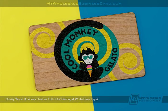
Wood business cards introduce a completely different design consideration: natural variation.
Unlike metal and plastic, which generally offer more consistent surfaces, wood has natural grain patterns, color differences, and unique characteristics.
Even cards made from the same wood type can vary slightly in appearance.
Rather than treating this as a limitation, designers can incorporate the natural character of the wood into the finished artwork.
Light Wood vs. Dark Wood: Why the Base Matters
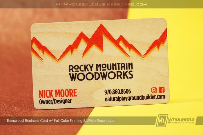
The wood species selected can dramatically change how a printed design looks.
Light-colored woods generally provide a brighter background, while darker woods can reduce contrast and change the perceived appearance of printed colors.
For example, a dark logo may stand out clearly on a light wood card but become difficult to distinguish on a darker species.
Similarly, a bright color that looks vibrant on a computer screen may appear more muted when printed directly onto natural wood.
Design tips for light wood:
- Use dark text and logos for strong contrast.
- Allow natural wood grain to remain visible.
- Consider designs with clean lines and open space.
- Use full-color artwork when the wood’s natural tone complements the design.
Design tips for dark wood:
- Pay extra attention to contrast and readability.
- Consider using a white base layer beneath printed artwork.
- Avoid dark-on-dark combinations that may disappear into the grain.
- Simplify fine details when necessary.
How Wood Grain Affects Artwork
Wood grain is one of the defining characteristics of a wood business card.
Some wood types feature relatively subtle, consistent grain patterns. Others have bold lines, dramatic color variations, or more pronounced textures.
These differences can affect the appearance of logos, fine text, and large printed areas.
A detailed design placed over heavy grain may look busier than expected, while a minimalist design can allow the natural wood to become a focal point.
When choosing a wood type, consider whether the customer wants the wood grain to stand out or remain a subtle background element.
Full-Color Printing on Wood: With or Without White Ink?
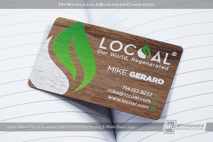
Our wood business cards use full-color printing, with the option to add a white base layer beneath the artwork.
This choice can make a noticeable difference in the finished design.
Printing Directly onto Wood
When artwork is printed without a white base layer, the natural wood color can influence the appearance of the ink.
The grain may remain visible through printed areas, and colors can appear warmer, darker, or more muted depending on the wood type.
This approach works particularly well when the customer wants to emphasize the natural material.
Printing With a White Base Layer
Adding a white base layer beneath the artwork creates a more neutral foundation for the printed colors.
This can help colors appear brighter and more vibrant while reducing the influence of the underlying wood tone.
It’s especially useful for artwork containing lighter colors, detailed logos, or branding that requires stronger color reproduction.
However, the white base may also reduce the visibility of the natural wood grain beneath those printed areas.
Reseller Tip: Ask your customer whether they prefer a natural, wood-forward appearance or stronger, more vibrant color reproduction. That decision can help determine whether a white base layer is appropriate.
Can You Use the Same Artwork Across Metal, Plastic, and Wood?
Technically, the same logo or design concept can often be adapted to multiple specialty card materials.
But that doesn’t mean the exact same production artwork should be used without adjustments.
Consider a customer who wants their logo on three different card types:
| Material | Design consideration |
| Black metal | Artwork may need to be prepared for laser etching, with attention to contrast and detail. |
| Glossy plastic | Full-color artwork can incorporate gradients, photography, and vibrant graphics. |
| Natural wood | Printed colors may be affected by the wood tone and grain unless a white base layer is used. |
The logo itself remains the same, but the artwork preparation and production method can differ significantly.
A design that relies on tiny details, subtle gradients, or specific color combinations may need to be simplified or adjusted for certain materials.
The goal isn’t to make every card look identical. It’s to preserve the customer’s branding while taking advantage of what each material does best.
Artwork Preparation: What Resellers Should Check Before Submitting a Design
Regardless of the material, a few basic artwork practices can help reduce revisions and production delays.
1. Start With High-Quality Artwork
Whenever possible, work with vector files for logos, text, and other graphic elements.
Vector artwork can be scaled without losing quality and is particularly useful for designs involving etching, cutouts, or precise placement.
Raster images, such as photographs, should be supplied at an appropriate resolution for the final print size.
2. Confirm the Material and Finish First
Before preparing production artwork, confirm exactly which product the customer is ordering.
A black metal card may require different artwork preparation than a stainless steel card, just as a clear plastic card requires different considerations than an opaque matte card.
Designing for the correct material from the beginning can prevent unnecessary revisions.
3. Follow Our Product-Specific Artwork Guidelines
If you’re submitting your own artwork, one of the most important steps is making sure your design falls within the production tolerances of your chosen product.
We provide artwork guidelines on our website for our different products, giving resellers and designers a reference when preparing their files.
These guidelines help you understand the specifications and limitations associated with the product you’re ordering, so you can design accordingly from the start.
Depending on the product and production method, important considerations may include minimum line thicknesses, spacing requirements, cutout limitations, safe areas, and other artwork specifications.
Taking a few minutes to review the appropriate guidelines before finalizing your design can help prevent avoidable revisions and ensure your artwork is prepared for production.
Reseller Tip: Bookmark our artwork guidelines and share the relevant information with customers or designers who are supplying their own files. It’s much easier to address production tolerances during the design stage than after the artwork has been completed.
4. Pay Attention to Small Text and Fine Details
Not every production method handles extremely fine details the same way.
Thin lines, tiny lettering, and closely spaced elements may need adjustments depending on the material and decoration process.
For best results, refer to the artwork guidelines for your specific product to confirm the applicable tolerances before submitting your final design.
5. Account for Bleed, Safe Areas, and Cut Lines
Artwork should follow the template and production requirements for the specific product.
Important text and logos should remain within the designated safe area, while background artwork may need to extend into the bleed area.
For custom metal cutouts and shapes, cut lines should be clearly identified and separated from the decorative artwork according to production specifications.
6. Set Realistic Color Expectations
Colors displayed on a monitor won’t always match the finished product exactly.
This is especially important when printing onto non-white surfaces, working with transparent materials, or using natural wood.
For color-sensitive projects, confirm available production options and requirements before promising an exact match.
7. Review the Proof Carefully
A production proof is an important opportunity to catch layout issues, spelling errors, placement concerns, and other details before manufacturing begins.
Make sure your customer understands what they’re approving.
Remember that a digital proof may not fully represent the reflectivity of metal, the transparency of plastic, or the natural grain variation of wood.
Choosing the Right Material for the Design
Sometimes the best approach isn’t to adapt a design to a particular material.
It’s to choose the material that best supports the design in the first place.
If a customer has a highly detailed, full-color design with photographs and gradients, plastic may be the most straightforward option.
If they want an etched logo, an unusual shape, or intricate cutouts, metal may provide more opportunities.
If the goal is a natural appearance with visible texture and character, wood may be the better fit.
Here’s a simple way to think about it:
| Design priority | Material to consider |
| Etched logos and metallic detailing | Metal |
| Custom cutouts and unique shapes | Metal |
| Detailed full-color graphics | Plastic |
| Transparent or frosted effects | Clear or translucent plastic |
| Matte and glossy contrast with spot UV | Matte plastic |
| Natural texture and visible grain | Wood |
| Full-color printing on a natural surface | Wood with optional white base layer |
These aren’t hard-and-fast rules, but they provide a useful starting point when helping customers choose the right product.
Better Artwork Decisions Lead to Better Finished Cards
The most successful specialty business card designs don’t fight against the material. They work with it.
Metal offers opportunities for etching, cutouts, and creative use of exposed surfaces. Plastic provides flexibility for full-color graphics, specialty finishes, and transparency. Wood introduces natural texture and character that can make every card feel a little different.
For resellers, understanding these differences makes it easier to recommend the right products, communicate realistic expectations, and guide customers through the artwork process.
And when you’re ready to prepare your design, don’t forget to reference our product-specific artwork guidelines to make sure your files meet the appropriate production tolerances.
When the material, design, and production method all work together, the result is a specialty business card that looks as good in person as it does in the original concept.
Ready to offer your customers more specialty business card options?
Explore our wholesale metal, plastic, and wood business cards to find the right foundation for your next project.